Idea:
Who doesn't love Oreos? (I mean, apparently some people...but Oreos are definitely one of America's most beloved snacks.) These self-proclaimed 'Wonderfilled' cookies have an obsession with creating a mind-blowing number of wild new flavors...I'm pretty sure I see new flavors everytime my wife sends me to the store. I'm also pretty sure that my wife sends me to the store so I can stock up on junk food and she doesn't have to feel guilty about it. But I'm cool with that.When I stumbled upon an Oreo taste testing data set, my brain went instantly into midnight snack mode. This particular data set is from the Famous Kaggale Data Scientist Master Mind, Dr. Rachael Tatman. Rachael created a very simple survey of twelve (12) Oreo flavors, using 5 taste testers. The dataset would be perfect for illustrating how to read data and to explain what one would look for when reviewing their data results. Plus, it talks about 'Americas Favorite Cookie,' the OREO! With a fresh glass of milk in hand, I embarked upon the goal of turning Rachel's awesome Oreo data set into a visual that would be almost as appealing as the cookies themselves.
Data Viz:
Here is a link to the Tableau Portfolio Page
Insight:
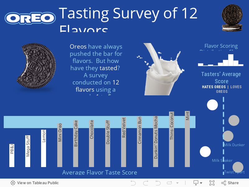
This was a great data set to explain what one would look for to make a Tasteful decision. No more standing in the cookie aisle, unable to decide whether those new Mint Oreos or Red Velvet Oreos would be better. The first image highlights the overall distribution of the data. As you can see, the data is a left-tailed skewed distribution. This basically means that the peak of the data is on the left side, with the higher score being closer to 5. With only 5 taste testers, these cookies were approved by everyone who tried them. (In grocery shopping terms, these are the flavors the whole family will enjoy.)
Next, we have the bar chart of the average score for each flavor. Since this data was on a small scale from 1 to 5, the average gives an overall picture of the score for each flavor.
This type of chart works great for visually displaying product review scores. The three white bars at the left are the lower scoring flavors. The light blue horizontal bar is the average score of all the flavors. The three flavors that score below the average could possibly lead to some interesting information in terms of product approval. Surprisingly, these testers did not like my personal fave, the MEGA STUFFED Oreos. It's sad, I know, but data doesn't lie. (Don't mind me while I drown my sorrows with another row of cookies.)
One thing to look for when creating data visuals is whether or not you have all the necessary data. In this case, we can assume that data is missing because one of the taster testers only gives responses to 2 of the 12 flavors. This could lead to skewed results. This is why it is important to pick a MEGA STUFFED sample of taste testers- most say above 30 or more people- to get a more reliable score. If one of the taste testers is unable to complete the entire survey, it would not dramatically alter the results in a pool of 30 people as it would with only 5 testers. (Whew, hang in there MEGA STUFFED, we still love you!)

The last chart helps us understand the cookie eaters in a visual context. This chart shows the average score given by each person and compares it with the rest of the taste testers. The dashed line sets a parameter for the total average score given by a cookie dunker. As you can see, the two tasters on the left seem to give lower scores in general. They have been labeled as a HATER of Oreos when compared to the rest. (This type of analysis can help you understand how the respondent feels about the review overall, which is a handy tool for data evaluations.) Since 2 out of 5 give lower scores, we could say that we have more Oreo LOVERS in the overall sample. I hate to keep bringing this up, but these two low-score givers must have also given low scores to the MEGA STUFFED OREOS. I chalk that up to not having milk. There's simply no other explanation.

Overall this type of analysis is great for finding out what the responses are to a particular survey. This is an excellent way to view the responses in a grand-scale context and make a better-informed decision for future products. In this case, Oreo could use this data to see which flavors were a slam-dunk, and which ones crumbled under the pressure. (See what I did there? I'm so punny.)
In this particular data, we could also investigate the three lower scoring cookie flavors and ask why are these lower? Maybe, for integrity sake, we should compile a group of willing taste-testers to give these flavors a second chance. But please, make sure you have a jug of fresh milk with you, because this could lead you down a long trip down the rabbit hole.
Project:
This project was created to help explain how to visually display a survey based dataset. The survey type of data compilation is widely used for gathering informational data. It helps provide insight on making informed decisions on what is working and/or what is not working. This project will help explain how to analyze this data type to provide extremely useful insight.Tools:
- Tableau Public
Data:
This data set was discovered on Kaggle.com and created by the Famous Dr. Tatman (Kaggle Data Scientist Extraordinaire). It is a survey conducted style of data that is very commonly used to gather intelligence. This set caught my attention simply because it was discussing OREOS- and Oreos are simply awesome and delicious. Therefore, this had to be done.Data Cleaning:
The data set had missing data, which was displayed as NULL in various fields and needed to be cleaned to adjust this. This was easily fixed in Tableau by filtering the data.Process:
This data viz was super simple and perfect for those looking for quick insight into a particular survey. The data was imported into Tableau. I first selected the responses, then right-clicked the selection, and chose the "Pivot" option. This stacks the data perfect for creating a visualization in Tableau.With the first chart, we needed to figure out the distribution shape of the data. I did this by selecting the "Pivot Field Values" for the values, and then selecting the histogram for the graph option. Doing this, the 'Milk Dunk' histogram is automatically made. This one was a left-tail skewed shape.
The Second chart is a bar chart which displays the average scores for each flavor. The average was used because this type of data was provided in the survey using a scale from one (1) to five (5). The "Pivot Field Names" and "Pivot Field Values" were placed on the workspace to represent the flavor and score. More specifically, the "Pivot Field Values" were averaged to get an overall picture of the scores from all five (5) samples. I added a horizontal line (using the data from the analytics tab) to show a visual display of the overall average (or standard) score. This helps the viewer to easily see which scores are lower and which scores are higher, in comparison to the average score.
The last chart was implemented to help understand what type of cookie eaters tried Oreos. Simply put, are these taste testers positive or negative in their overall responses? (Are they Oreo lovers, or Oreo haters?) Honestly, I must say that these taste testers do not seem to be very positive, as is evidenced by the horribly disgraced rating they gave to the MEGA STUFFED OREO! (Hang on, I need a minute, it still hurts.) Okay...back to work. I wanted to display this last chart as a plot chart, but it could have also been created as a bar chart. For visual purposes, I felt that a plot chart provided a better balance for the dashboard's overall appeal. The same concept was done with this plot chart as with the previous bar chart (for the flavor scores above). The plot chart helps us identify what type of people are taking the survey by viewing the taste tester's cookie ratings as an averaged score. I divided this score into two categories based on whether their average score was higher or lower, giving us two people who "HATE" Oreos, and three who "LOVE" Oreos.
You can use these same principals with any survey-based data set to get a great visual of the information provided.
Comments
Post a Comment