Idea:
Date night. The idea of going out and having fun with the person you enjoy spending time with most... Who doesn't look forward to date night? To be honest, after having 5 kids and running multiple businesses, we don't see many date nights at our house. So when we do get the chance to go out, we want to make sure to pick somewhere awesome! That said, I have been temporarily banned from picking restaurants, which is actually awesome for me because it prevents that loop of trying to agree on where to eat for 15 hours until we both starve and end up at the same place as last time.
The idea for this project came from a data set for Makeover Monday on Data.world. Looking over the stacked bar chart visual, I thought it would look better (and be more fun) as an interactive infographic. I especially wanted to provide a location view of the cities on a map, to really add some visual appeal. While the original bar chart includes the flag, not everyone understands where the location of these places actually is. I also wanted to break apart the cost information, since some of the cities might have a higher cost in one category but cheaper costs for everything else when compared to all the cities. Lastly, I wanted to rank the cities based on cost and event.
The use of Microsoft PowerPoint was used to make this infographic. Microsoft PowerPoint is a very common tool used throughout the world, and most people do not know that it can do much more than make slides shows. For example, it can make interactive graphics displays perfect for this type of idea. My goal was to use a simple and widely-used program to show something fun and interactive.
Data Viz:
Here is a video of the graphic:
Insight:
One of the most interesting things was the ranking of New York City in comparison to the other cities. New York City was ranked in the top five (5) in all date night events. This makes it one of the most expensive cities in the world to go out on a date!

Russia had the cheapest BigMac cost out of all the cities. It was below $3.00 USD, almost half of the price of the United States. The real question to be asked is if the quality is any good? What kind of magic ingredients do they use to get the prices so low?

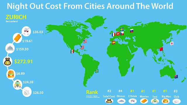
Zurich had four (4) of the highest cost events when compared to the other cities. It ranked the highest in Movies, Taxis, 2 drinks, and Big Mac. It would be smart when visiting this city to find places within walking distance that are not fast food or cocktails. Maybe a small restaurant with local charm? Definitely bring some extra cash to Zurich!
It was surprising to see that Hong Kong was about 75% more costly than Mexico City. Mexico City ranked lowest of all the cities in most of the date night events. While these are arguably on opposite ends of the cost-of-living spectrum, a difference of 75% still seems quite drastic for big cities. Mexico City's highest rank was #11 for the Big Mac. The total night out in Mexico City was just over $100.00 (USD). You're basically guaranteed a fun night without breaking the bank. Awesome!


Project:
This was a data set for Makeover Monday on Data.world. The project was to makeover a data viz from Statista. The task was to improve the data viz. This project was based on the cost of a night out in different cities around the world.
The original data viz:

Tools:
- Microsoft Excel
- Microsoft PowerPoint
- Google Image Search
- Microsoft Paint
Data:
The data originates from UBS and has a dataset available on Data.world. The data includes 13 cities from around the world. The category information has seven (7) variables with a monetary value of cost displayed in United States Dollar ($USD). The data breaks down further into two types of nights out events: party night and date night.
Data Cleaning:
The data cleaning was extremely easy and simple to complete for this type of data viz. The cleaning was completed in Microsoft Excel. The removal of the two categories of date night and party night was the main cleaning technique used for the dataset. This was not needed in the goal of the visual graphic.
The combining of dinner and two (2) drinks at dinner as a single value will help consolidate the data. This value was called "Dinner". The formula used to combine the data into one value was completed by adding the cells together.
Dinner = Drinks at Dinner + Dinner
Process:
The biggest part of creating this data viz was finding the right graphics to use for the build-up of the layout. The use of a world map SVG file a bright green and aqua color scheme gave it a perfect visual effect. The cartoonish looking map was simple enough to provide a fun but simple way to display the cities around the world. The SVG file was found on Google image search, using the 'labeled for reuse' filter under Tools. A few edits were made in Microsoft Paint.
The second challenge was finding flags of the countries. Originally, I wanted to have push needles in the map with the flag attached at the end. This looked over-complicated and was simplified to just the flag at the city location. Each city was located by visually matching up the cartoon map location with its corresponding location on Google Maps. While this was not exact it gives a fairly decent representation of location.
The last thing I needed for the display was icons to represent each type of cost. Essentially, I wanted to find simple, SVG cartoon graphics with an icon-style to represent each event of the night. These were found using Google image search and finding a PNG file without backgrounds using the same filter options as before.
With all the images gathered, it was time to build the data viz. The layout was constructed to display:
- The location on the map
- The cost of each night event
- The total cost of the night
- The ranking as compared to the other cities in the data set
The break down of each cost was placed on the left side with an arch type of display, with the total cost of the date night in the center of the arch. The bottom of the graphic shows the ranking of each cost when compared to the other cities, ranking from #1-13. (This was completed based on the night event type.) It was possible for a city to have two categories with the same ranking. For example, Zurich ranked #1 in the Big Mac, 2 Drinks, Taxi, and Movies categories. The highest ranking category for each city was highlighted in yellow.
Lastly, I wanted the map flag to become clickable to send the side view to the specific city data when the corresponding flag was selected. This was completed using Microsoft PowerPoint. The process was relatively simple. I created an anchor point on each flag location, which jumps the viewer to the slide for the corresponding city's data. It was necessary to do this on each slide, so that all slides were inter-connected. This allowed for the interactive change of data during the presentation view of PowerPoint. When looking at the presentation, it is viewed as one single page, because only the data on the sides and bottoms change, giving the appearance of an interactive visual.
Microsoft PowerPoint is great when saving as a graphics file. You can save your work as a video, a presentation, a PDF collection, and even a JPEG of the data viz infographic, by simply changing the "Save File As..." as something else.
Comments
Post a Comment