Idea:
The idea is to highlight the difference in gender diversity within the designs. In this design, all the bar charts are a little overwhelming and could easily be reduced to a comparison bar chart. The decision to focus just on gender and to make a gender icon that was both a male and female person within the gender icon. The image had to be made to form the simple male-female icons used on bathrooms in public places. The images were found using Googles Image search and edited in Photoshop. Lastly, the ethnicity of the company is also important to highlight. A stacked bar chart the same height as the 'person' graphic is used to highlight the percentage of diversity based on ethnicity.
The colors were the hardest point to choose from. The grey background increases the visibility of the Teal and Hot Pink that represent the genders. The same color palette was used throughout the design. The location of the plot chart on the left highlights the male and female employee population percentage of each company. Anything shown in Hot Pink is more females, and anything in Teal is more males.
Data Viz:

Here is the actual Tableau workbook. *I did NOT make this in Tableau Public, so I do not have it on a Tableau server.*

Insight:
The biggest insight taken away from this data viz was the cluster of the percentage of male employees in organizations. Not very many organizations had a majority of females when compared to other organizations. This type of information is useful to companies that want to increase their diversity within the organization. Diversity is an important necessity within an organization. It can provide new and different ways of completing a task. It is a little disappointing that most of the organizations have not taken a more active role to hire more female employees throughout the organization.


Project:
This was a data set for Makeover Monday on Data.world. The project was to makeover a data viz from Diversity In Tech. The task was to improve the data viz. This project was based on the diversity in large tech companies as compared to other large companies and the USA Population.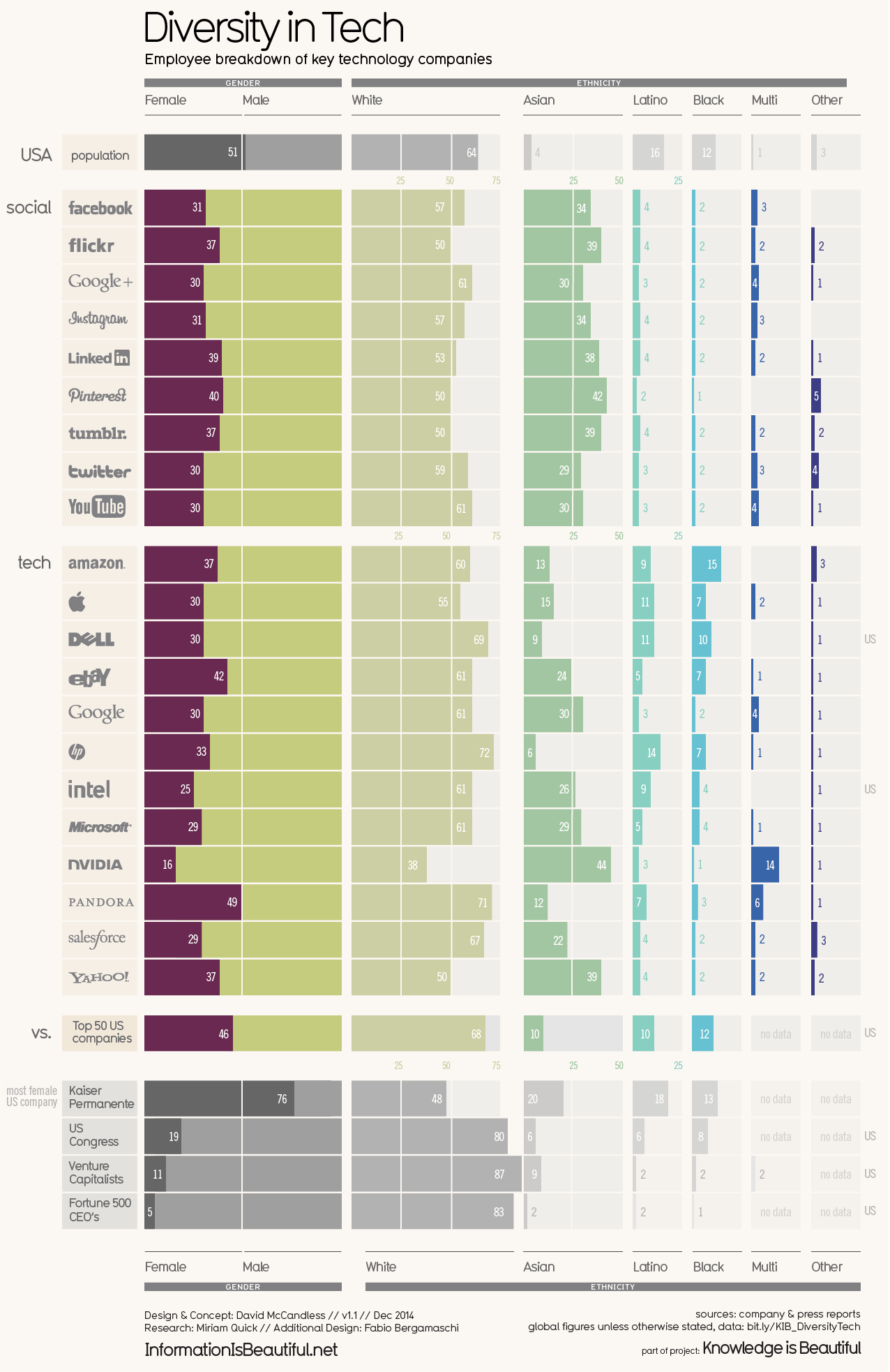
Tools:
- Tableau Public
- Microsoft Excel
- Adobe Photoshop
Data:
The data provided was downloaded from Data.world, which was originally sourced from company and press reports. It provides information about the race and gender percentage of employees in an organization. Most organizations included in the data set are high profile tech companies, with some other comparable organizations like US Congress and Kaiser Permanente.Data Cleaning:
The data came pretty clean. The cleaning process of the data included mainly filtering and ensuring the data was read as a percentage and not a decimal number. This was simple to correct in Tableau by changing the format of the number. This is done by right-clicking on the field and selecting "Default Properties" and then "Number Format..." In the menu select percentage type. Remember to ensure the data is in a decimal field or it will calculate the whole numbers as higher than 100%.Process:
This Tableau project will have custom graphics to make a unique type of chart. The biggest challenge is getting the person icon size to match the bar chart behind the person graphic icon.The second was getting the icons on the plot chart to compare all organizations the percentage of female employees. The icons provided by Tableau were used to make the female icon. This was difficult to get in the right size and location, but it did provide a great view of clustering for the female percentage of employment.
The last part was to make the ethnicity stacked bar chart. The information needed to highlight just the race and monochrome variations of the color Teal was filtered. Different colors would have taken away from the main focus of gender diversity in this data viz. The bar was annotated with the race and the percentage of employees. This was a little harder to get in the view, but the mouse over provided more in-depth information about the data.
Comments
Post a Comment