Insight:
What is more interesting than knowing not only how many women created crossword puzzles compared to men, but which day of the week is each gender most likely to publish them? Should I point out that this is sarcasm, or did you figure that out already? The one thing really lacking from this project's data set was the age of crossword puzzle contributors. Seriously, I am DYING to know how many people spend their 20's (or 30's) turning crossword puzzle writing into a lucrative career. I'm making a mental note to stock up on #2 pencils right now...and wine, while I'm at it. (Wine improves anything, including boring data sets.)
Anyhow, my number one goal when taking on this edge-of-your-seat project was to take an existing data set and create a radar chart to display that data in an aesthetically pleasing format. 'Cuz nothing bulks up a portfolio better than a wide variety of awesome data viz displays. So let's take a look at which gender writes more crossword puzzles, and when.

2001
When creating a visual display for this data, the biggest trend I noticed was that the polygon shape was mainly on the right side of the graph throughout all of the different years and decades. This means that most women were creating crossword puzzles between Sunday and Wednesday. Does this mean that women are the most bored during the first half of the week? Or is that when women are most productive? Considering that they have to put up with us men throughout most of the weekend, it's a wonder they don't use that time to practice digging holes in the backyard. (P.S. If you don't get that joke, you probably aren't married.)
It should also be noted, however, that the male gender still dominated the overall percentage of crossword puzzle contributions. Men are far more likely to create crossword puzzles when analyzing the gender of contributions. When you think about how many movies and tv programs show old men reading the paper on weekend mornings, it makes sense that men would be the ones writing them, too.
The years 2001 (see chart above) and 2008, however, had at least 50% contributions by females on "Monday." (So this would support the theory that women are particularly productive on Mondays.) It was surprising to see when most women made crossword puzzles, and how often they did so.
 2008
2008
Anyhow, my number one goal when taking on this edge-of-your-seat project was to take an existing data set and create a radar chart to display that data in an aesthetically pleasing format. 'Cuz nothing bulks up a portfolio better than a wide variety of awesome data viz displays. So let's take a look at which gender writes more crossword puzzles, and when.

2001
When creating a visual display for this data, the biggest trend I noticed was that the polygon shape was mainly on the right side of the graph throughout all of the different years and decades. This means that most women were creating crossword puzzles between Sunday and Wednesday. Does this mean that women are the most bored during the first half of the week? Or is that when women are most productive? Considering that they have to put up with us men throughout most of the weekend, it's a wonder they don't use that time to practice digging holes in the backyard. (P.S. If you don't get that joke, you probably aren't married.)
It should also be noted, however, that the male gender still dominated the overall percentage of crossword puzzle contributions. Men are far more likely to create crossword puzzles when analyzing the gender of contributions. When you think about how many movies and tv programs show old men reading the paper on weekend mornings, it makes sense that men would be the ones writing them, too.
The years 2001 (see chart above) and 2008, however, had at least 50% contributions by females on "Monday." (So this would support the theory that women are particularly productive on Mondays.) It was surprising to see when most women made crossword puzzles, and how often they did so.

Idea:
The idea for this project was to create a radar chart using existing data. This dataset is perfect to try with Tableau Public Account. Tableau does not offer a radar chart with the "Show me" tab. This would be a more formulated type of chart. The idea was to use a black and grey monochrome color scheme to see the time difference in the way women worked on the crossword.
Data Viz:
The link to the workbook for download is on my Tableau Public portfolio.
The link to the workbook for download is on my Tableau Public portfolio.
Project:
This was a data set for Makeover Monday on Data.world. The project was to makeover a data viz from XWord Info. The task was to improve the data viz. This project was to gain insight on how many women constructed a crossword puzzle in the Shortz Era and what day of the week they had published work.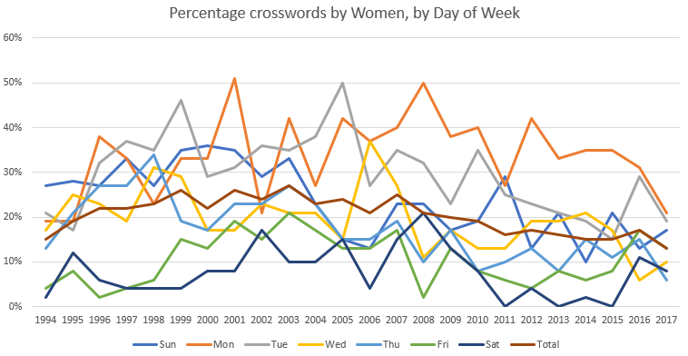
Tools:
- Tableau Public
- Microsoft Excel
- Adobe Photoshop
Data:
The dataset comes with the year and the total amount of gender type that worked on the published crossword puzzle. It was broken into male and female. The last bit of information in the dataset was the day of the week. The years range from 1993 to 2017. Again, I feel like I should note that it would have been awesome if the data set included the age of the contributor. (How many years worth of pencils I should order, exactly?)The data provides a time series which is perfect to display. It also shows the amount of difference in the value of men and women who contributed to the crossword puzzle.
Data Cleaning:
The data cleaning process was extremely easy after syncing the data set from Data.World to the Tableau Public interface. It worked really great to fetch the data with no problems.Process:
Since the data is in decimals and not a percentage, a new "Calculated Field..." needs to be made to get both the percentage of women and percentage of men.
% of Men = Men ÷ (Men + Women)
% of Women = Women ÷ (Men + Women)
The hardest part was trying to figure out how to make a spider chart in Tableau since they do not have it as an option. This required a Google Search. The code used for the "X" axis is:
case [Weekday]
WHEN 'Sun' then 0
WHEN 'Mon' then [% of Women] *SIN(2*PI()/7)
WHEN 'Tue' then [% of Women] *SIN(2*2*PI()/7)
WHEN 'Wed' then [% of Women] *SIN(3*2*PI()/7)
WHEN 'Thu' then [% of Women] *SIN(4*2*PI()/7)
WHEN 'Fri' then [% of Women] *SIN(5*2*PI()/7)
WHEN 'Sat' then [% of Women] *SIN(6*2*PI()/7)
END
This was easy to read and can use this formula later for radar charts with more than seven (7) or less than seven (7) sides. The same was for the "Y" axis for the data as well:
case [Weekday]
WHEN 'Sun' then [% of Women]*COS(0)
WHEN 'Mon' then [% of Women] *COS(2*PI()/7)
WHEN 'Tue' then [% of Women]*COS(2*2*PI()/7)
WHEN 'Wed' then [% of Women] *COS(3*2*PI()/7)
WHEN 'Thu' then [% of Women] *COS(4*2*PI()/7)
WHEN 'Fri' then [% of Women]*COS(5*2*PI()/7)
WHEN 'Sat' then [% of Women] *COS(6*2*PI()/7)
END
Starting with this calculation, it was necessary to play around with the days of the weeks to get "Sunday" at the top of the radar chart. The flow was clockwise, which made "Monday" next on the right side.
The second challenge was making the scale. The shape of the polygon was copied and input into Adobe Photoshop. The outline of the polygon was used to make the background for the chart. They were reduced in sizes of 75%, 50%, and 25% of the shape centered on the original. This gave the correct size dimensions for the percentage lines for the chart to follow.
Once this shape and graphic were created it was set as the background of the chart. After a few trial and error corrections on color, it was surprising at how easy and on the point that was for a background image.
The next thing was to create a "Year" filter with a button selection on the right side. This makes the data interactive with the user.
The data sheet was duplicated 3 times to create an overview of the time change. The first one was filtered from "Year" 1993-1999 and labeled as the "1990s". The second was filtered with "Year" 2000-2009 and labeled as the "2000s". And the third in a similar fashion, label as the "2010s" for the "Year" 2010-2017.
These three little time displays were placed along the bottom and made to not change with the interactive filter. It was to show the change in time over the years based on an Average of percentage.
The last thing was creating the color scheme. The idea was to look like a crossword newspaper puzzle, which went with the black monochrome and a yellow highlight.
Comments
Post a Comment