Idea:
I discovered a great data set on Kaggle today that really hit close to home for me. On the off chance that you haven't leisurely perused my bio section just yet, let me save you from a few moments of time spent: I have a background as a Flight Engineer on the Orion P-3 aircraft, gained while serving in the US Navy for 8 years.
So imagine my surprise when I found data relating to aircraft- although it is a somber context, it was also really awesome to go back to my flying days for a moment. During our training, we would learn about various types of aircraft crashes and what went wrong. Then we would discuss what we would have done differently and the lessons learned from the crash. This training was quite extensive and very important. You remember that pilot who landed the airplane in the Hudson River like a superhero? Hello, previous military training. (And maybe his 30+ years of aviation experience after the military helped, but it was mostly the military training.) Nevertheless, it is not an understatement to say that the knowledge of previous aircraft crashes and potential cause/effect/correction is a HUGE necessity in the world of aviation.
This data set was great to stumble upon given my previous career in flight, and I was eager to gain more insight into the history of aircraft crashes around the world. My idea was to take the existing data set and build something that could give viewers insight about various aircraft crashes. I wanted this project to be something that could be used by any person or organization to view and potentially learn from others' mistakes.
This data viz is dedicated to those who have lost their lives in flight and their families.
Data Viz:
Insight:
This data visualization can be used to gain a lot of insight and information about aircraft crashes over the last 100 years. Let's explore the data below.

When looking at how many lives were lost compared to those that survived, we can look at the data chart towards the bottom (Casualties by Year) and see that there are peaks during two time periods that show a significantly higher number of survivors than on the average airplane crash. Why were there more survivors during these two periods? Unfortunately, the data doesn't give us any insight into the WHY of things. That is a problem best left for Google. Perhaps we can spend some spare time looking up the individual crashes and seeing what happened to set them apart? Keep in mind, however, that this is data that spans crashes over the entire world, so we are talking about multiple flights for each recorded year. I think it would be a fair assessment to conclude that in 1998-2000, the pilots manning the controls were well-trained and amazingly prepared for disaster. This time period had a HUGE number of survivors when compared to other time periods. This data could be used within the aviation field to examine training methods, average pilot experience, particular aircraft safety, and more in an attempt to understand and further strengthen the abilities of the pilots who managed to secure the safety of such a large number of passengers. This chart also displays two more interesting tidbits of information. First of all, we can see that the overall amount of crashes starts to go down dramatically around the year 2000. This is amazing- we are making progress in the long journey of flight travel, making it faster, more efficient and safer than ever. The second thing we can determine from this chart is that more people are starting to survive plane crashes in general- especially when compared to the 1940s to 1980s. In the 40's, we had crashes we can attribute to World War II. In 1958, Pan America (PanAm) launched the Boeing 707 flight from New York to London, creating the availability of commercial trans-Atlantic flights. If Frank Abignale, Jr. was able to walk onto a plane and fly it, no questions asked, then PanAm's credentials really weren't up to snuff and crashes were bound to happen. (If you've never heard of Frank Abignale, Jr., you really need to brush up on your Leo DiCaprio movies, it's one of his best.) All kidding aside, it took a couple of decades for aviation experts to be able to devise aircraft and training procedures that started to result in crashes being minimized and lives being saved. This is great news! We first see a rise in crash survivors, then a trending drop in crashes themselves. Amazing!

The clickable circle on the left side shows all of the airplane crashes side by side. Each crash is displayed as a dot, colored from light to dark based on the number of casualties per flight, whereas the size of the dot symbolizes the total amount of people on board the flight. The first thing we see when looking at this circle is that there are two large, deep-red dots that immediately stand out. These dots signify a large number of people on board the aircraft as well as a high number of casualties when the airplane crashed. In the circle, you can move your mouse over each dot to display a summary of the crash and explain what happens. This is a great way to display a large amount of information in a limited space, while still maintaining a visual appeal.
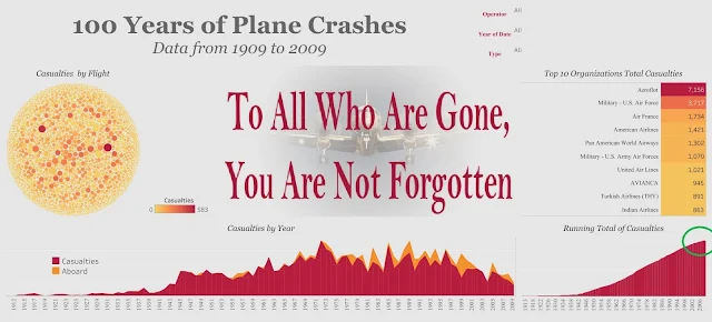
The chart on the bottom right shows the total number of lives lost due to aircraft crashes. As the years progress, we see the total count of casualties with a very low casualty total until 1940, and a rapidly rising slope from 1940 onward. If you look closely, however, you can see that the rise of the slope starts to taper off at the top. This reiterates the fact that aircraft casualties are started to decline significantly compared to previous years. Travel by flight is slowly becoming safer and safer as time goes on.

The chart on the top right is especially useful for frequent travelers. This chart classifies the total casualties by an organization. A viewer can use this chart to determine which airline to avoid for their future trips. Some things to consider when exploring this data is the amount of time the company has been in the flight business. For example, some of the airlines on this chart are fairly new, but already have a high count of lives lost due to aircraft crashes. (Hint: these companies are at the bottom). The other interesting name on this chart is Pan America. They only lasted about 64 years in the commercial flight industry and claimed over 1,000 lives in the process. (It makes you wonder the real reason they are out of business...and no, Mr. Abignale never crashed his flights.)

The last thing I want to mention this data visualization is the ability to filter the data by Aircraft and/or Organization. You can use the drop-down menu at the top right corner of the chart to select these filters, and the chart will adjust accordingly. The image above shows the data after I applied a filter for the aircraft I was a part of during my time in the US Navy. (Pop quiz: What aircraft did I fly in the US Navy? If you scroll up, that's cheating.) By selecting the P-3 (or Lockheed Orion, it's a non-military name) as the aircraft type, the results appear as shown above. You might notice that you can see two (2) large crashes which claimed a large number of lives. The two peaks in 1968 and 1973 show those two large crashes on the bottom left chart. While you can ask a Navy FE what happened, they will not only tell you the story in detail over a few beers, but they will also tell you what they would have done to save the day. Flight engineers get a lot of the stress, very little of the decision making, and none of the credit. (But I'm biased, of course.)
Project:
This project idea came to me after coming across a great data set found on
Kaggle.com from Sauro Grandi. (Thank you, Sauro, you are amazing.) I saw a great chance to analyze various aircraft crashes and discover if there were any patterns or insight related to the casualties caused by aircraft crashes.
Tools:
Data:
The data can be originally found on
Kaggle.com. The data used is version 4 and downloaded as a
CSV.
Data Cleaning:
This data came with a large amount of information. The only data needed to be was related to the casualties of each flight. For example, this particular project required the number of casualties per crash, the number of survivors on board, the date of each crash, and the airline and aircraft involved. The existing data set also offered a location of each crash, which needed to be cleaned for geolocation, but was not necessary for this project. It could easily be cleaned at a later date to analyze the location of the crash if desired.
Process:
The first thing I needed to do was import the data into Tableau Public. This required the CSV file to be opened in Microsoft Excel and then saved as an Excel workbook because the public version of Tableau does not import CSV type files. (This is a feature of the Tableau paid version, however.) Once the file was imported, I wanted to see the casualties over time using a line chart display. I added in the total number of passengers aboard on the same axis of the chart, but in a different color. The "aboard" total was placed behind the casualties graph to show a trend in years where there were more survivors (if any). This was displayed with the yellow color (total passengers aboard) above the red (fatalities) on the graph. The second chart I created was the bubble chart (the large circle to the left), to show each plane crash in comparison to others. Because each bubble represents an aircraft crash, the circle was a perfect visual representation of this data. I assigned a color to each flight based on the severity of casualties, and the size based on the total number of passengers. Large circles that are light yellow signify more survivors, whereas large circles in deep red signify more lives lost in the crash. To create the chart that displays the running total of lives lost by the year (at the bottom right), I wanted to create an area line chart to give a visual representation for the running total of casualties over time. The starting year for the chart is 1909 and the ending year is 2009. By using a time span of 100 years, we are able to get a clean and compelling visual. For the next chart, it seemed important to know which organization has had the most fatalities throughout the 100-year time frame. I created a top ten chart based on the total amount of lives lost in the crashes and color-coordinated the chart to match the rest of the display. The last portion of this project was adding the filtering options at the top right of the display. The filters used include the type of aircraft, year, and the organization. The use of these filters helps the user pinpoint any particularly relevant information they may want to see in the chart.
Please take a moment to remember those who have lost their lives to these tragic events in history. They should be remembered and not forgotten.


Comments
Post a Comment