Idea:
Because I was really feeling the Christmas spirit this year, I wanted to make a Data Viz that looks Christmas-y and fun. The compiled data spans over a period of several years and utilizes the average dollar amount spent on Holiday gifts to create a festive visual picture. The idea is to analyze the change in percentage by year in correlation to the amount spent on Holiday shopping. Using the time series data as a bar chart graphic, I am going display the data as a cityscape with Santa riding in the night sky. You're feeling the Christmas spirit already, I know it.
The bar chart (representing the years) looks like the buildings of a city backdrop, and the percentage of change (in holiday shopping) represents the stars of the night sky. The final touch will be adding Santa Claus riding off in the night sky.
Data Viz:
Here is a link to my Tableau Public page.
Insight:
It was especially interesting to make this visual display and be able to see the impact that the 2008 housing crisis had on the average spending on the holiday season. There was almost a 30% drop in spending. It amazes me how something like a mortgage industry crash can affect all other aspects of economics, including the amount spent on gifts bought for that Christmas season.

The other informative insight can be found when looking at the pattern over the various years. Approximately every eight (8) years the amount of spending drops, then it gradually climbs back up again. It is interesting, but it is also encouraging because it shows a pattern that all things are temporary. Good years and bad years tend to cycle through each other, teaching us that we will always have good times to look forward to in the future, even when it might seem otherwise.


The other informative insight can be found when looking at the pattern over the various years. Approximately every eight (8) years the amount of spending drops, then it gradually climbs back up again. It is interesting, but it is also encouraging because it shows a pattern that all things are temporary. Good years and bad years tend to cycle through each other, teaching us that we will always have good times to look forward to in the future, even when it might seem otherwise.

Project:
This project was created using a data set for Makeover Monday on Data.world. The project was to makeover a data viz from Statista.com. The task was to improve the data viz. This project I wanted to make a simple Christmas scene with the data.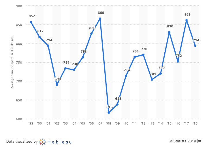
Tools:
Data:
The data is to variables, year and the average amount spent by a person on Holiday shopping. The data was taken from Statista. The average amount is in US Dollars (USD) and is per person.Data Cleaning:
The data is already really clean. The only thing needed to do is make some calculations in Tableau. The calculation will be the change in percentage from the prior year. It can be a positive or a negative number. This separation will help decide the color of the stars.Process:
The data was imported from data.world into Tableau Public. Next to get the percentage of change for the year in a change in percentage. This was completed by making a new calculation. In the Analysis menu, under "Create Calculated Feild..." the following formula was entered to achieve this calculation; (ZN(SUM([Christmas Spend In Us])) - LOOKUP(ZN(SUM([Christmas Spend In Us])), -1)) / ABS(LOOKUP(ZN(SUM([Christmas Spend In Us])), -1)) After this, I needed to make to charts, the bar chart, and the plot chart. The bar chart of the cityscape was completed but displayed really high bars. Editing the "X" axis to give the range of the data. The range input was fixed at 550 low to 900 high. This allows for the bar to shrink to reasonable city building hight. For color, a spectrum of yellow to blue based upon the different from the average helped provide the color difference in the buildings. On to the stars. The stars are going to be made with the percentage difference in amount spent form prior year. This provides the different locations of the stars. The shape used was the standard stock star shape in Tableau. To get the color, I separated the colors into two, yellow and white. Anything white is a positive increase and anything yellow is a negative change. Now we have the cityscape and the night sky. Now to add the flying Santa in the night sky. This was completed with a simple Google search for a PNG. This was the image used;
The last-minute add-in was the slide rule for the years. This will allow for a fun cityscape to change based up years. This was set directly in the middle of the image to make it ease of use.
Comments
Post a Comment