Idea:
My main goal, for this project, was to see if I could illustrate the common problem of data misinterpretation. The idea for this data visual comes FRESH to you from the most recent Make Over Monday project- Week Three (3) of 2019. The data visual in its original form is displayed with a blue monochrome color scheme, and color-coded in different shades of blue based on the percentage of people being paid at or below minimum wage by state. You can see the original data visualization at the very bottom of this post.Because nothing says 'trolling' like politics, I thought it would be fun to break this data up into time (year) and presidency term. Before anyone starts panicking, I did not include our most current presidency in this data visualization- we can save that bickering for facebook.
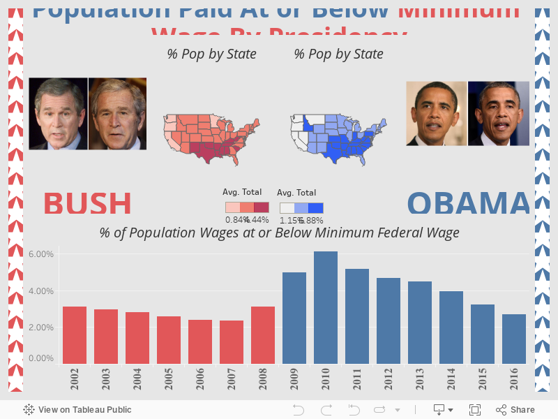
The data included information from 2002 up to 2017. With this data, I was able to compare the Bush Administration to the Obama Administration in terms of wage levels earned by the American people. The goal for this project is to display the information by state, year, and political party. Also, just for fun, I have included a picture of each president before and after their 8-year presidency terms.
Data Viz:
Here is a link to the Tableau Portfolio
Insight:
One of the most difficult things when analyzing research, including statistics and data evaluation, is to examine and present the data without any personal biases. Here's the catch- data can be misread and used wrongly without too much effort and sometimes even by accident. We see it all the time in the news- most recently with an interesting debate about whether or not coffee is good or bad for you, for example. (Regardless, I still enjoy about 7 cups of coffee per day...)Using this chart, let me show you a great example of how data can be misinterpreted. Let's hop into the DeLorean (did I just age myself?) and travel back to 2008, say around the end of year-ish. Do you remember what happens in late 2008? BOOM! The housing market collapses. Bush was working hard to stimulate the economy (and soften the blow) with subsidies, payouts, and stimulus checks, among other efforts. It was a rough year. Yeah, now you remember. On top of all of that, Obama was about to take office in a few short months. What better way to come into office than cleaning up someone else party mess (pun intended)? Cue the mom from Mrs. Doubtfire, this is her jam.

The data here shows that wages are extremely low during Obama's first two (2) years of presidency, but it begins to trend back down. What we can conclude from this data is that the effects of 2007 and 2008 put a massive strain on the economy, which we started to see in 2008 but really felt the blow in 2009 and 2010. This shows what a huge impact the housing market has on the overall economy. Not only were stocks plummeting, but employees' paychecks took a hit- a hard hit. This is a classic form of economic cause-and-effect. While the Obama Administration was able to reverse the effects throughout his presidency, it was a continual work in progress that took several years.
This being said, it is easy to look at this data and, without thinking too much about the circumstances behind the data, you can see that the first two years of the Obama Administration held the highest level of low wages on the entire chart. If jumping to initial conclusions simply by looking at this chart, it looks like the Obama Administration was a wage-wrecker.
The biggest insight for this data viz, then, is to remember what is happening in your data- what does the data MEAN. While a data chart might show one thing right away, as the viewer we need to understand the reasons for each reading. This is why you will almost never see a data visualization without some sort of background information accompanying it- not in good data science, and not in good journalism. Even with background information, it can still be easy to misinterpret data. It is our responsibility as data-visualists to try and eliminate that as much as possible and remain unbiased at all times.
Project:
This was a data set for Makeover Monday on Data.world. The project was to makeover a data viz from Business Insider. The task was to improve the data viz. This data set is about the percentage of people in the US who gets paid the federal minimum wage or lower.
Tools:
Data:
The data set comes from Data.world. However, the original data comes from the Bureau of Labor Statistics.Data Cleaning:
The data was clean and ready for importing into Tableau. The only change needed was changing the numbers from decimals into percentages.Process:
The first thing I needed to do was make the small maps of the USA. I combined the data from all 8 years of each presidency and filtered the image to show the average percentage of the population, by state, that made at or below minimum wage. For example, the average wages of each state during the Bush Administration is displayed in the red map, and the average wages of each state during the Obama Administration is shown in the blue map. I went with three shades of each color, to uniformly represent the severity of each state, ranked light to dark from GOOD, AVERAGE, BAD. This was done for both maps, with the darkest color being the lowest (worst) wages. To keep things within the political theme desired, I used red and blue for the political party affiliation of each president. This would not have worked if both presidents had been from the same political party, so I lucked out with that one.My second goal was to display the change in wages over time in yearly increments. I decided to use a bar chart and balanced it out visually with vertical rows of stars along each side border, for a stars and stripes theme. I kept the red and blue color scheme, corresponding to the years of each president. This split the dashboard up into two (2) sides extremely well for an easy but aesthetically pleasing effect.
The last thing I needed to really set the visual over the top was a picture of each President. I chose a picture of each president at the beginning of their presidency, and another picture of them at the end of their presidency. I used this to give a fun (but somewhat shocking) visual display of the rapid aging process that occurs when taking on a role as significant as the President of the United States. That is one job that will age you faster than any other.
Overall, it hopefully comes together in a fun and informational visual display, and the original data set has new significance when broken down into the terms of presidency, adding a little extra perspective to the original visualization.
Comments
Post a Comment